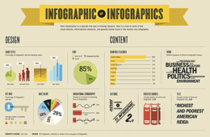
No, it’s not your imagination. Infographics are everywhere these days. Quite seriously, there is at least one blog that features infographics daily. Cheekily, here’s an infographic about the rise of infographics and a spoof post, just to prove how ubiquitous infographics have become. 
As Six Estate, we pride ourselves on our use of ethical journalism as a content marketing method. The content we produce on our clients’ behalf always is meant to satisfy two masters: first, journalistic integrity — i.e., content that presents a researched perspective — and second, content curation — i.e., selective news presented for the establishment of thought leadership, including inherent marketing purposes.
Just a few years ago, it would appear that these missions would be at odds. Yet, as journalism evolves and marketing is increasingly value-focused, it seems convergence isn’t just inevitable, but also a powerful self-selecting method of information gathering.
Infographics themselves represent these converging trends. Part of their appeal is the ability to offer a coveted at-a-glance understanding of complicated topics. They neatly compress data and drive clicks.
Witness the startup Visual.ly, which fills the gap between withering full-time art departments in both newsrooms (journalism) and ad agencies (marketing), and adds consumer demand for new ways to explore and understand data.
Do Infographics Weaken Journalism?
A poorly researched or executed infographic can be just as common as junk reporting or a badly written blog post.
Linda Forrest of Francis Moran & Associates neatly summarizes the journalism/infographic debate here:
Data visualization is nothing new, but in recent years, this approach has gained significant traction as a tool used by marketers and journalists alike. There is significant criticism of the overuse of the tactic, and arguments abound that they are more about style than substance.
Best practice: Just as good journalists credit sources, list all relevant data sources within the infographic. Clearly state who produced the infographic, too. A recent favorite of mine that artfully combines data and transparency is Massive Health/Column Five’s infographic “Carbs Are Killing You.”
Are Infographics a Plus or Minus for Content Marketing?
Surely, a researched and well-produced infographic is a definite plus to content marketing effort because it can be so enticing to share. However, quality matters.
Best practice: Give your infographic the best chance of being seen and shared with a comprehensive social media/PR strategy. Don’t forget that infographics can also be used as a great internal communications tool, too.
In summary: Infographics are a natural convergence along the evolution of journalism and content marketing, and, when crafted carefully, can be an excellent tool.