As all social media users are well aware, things change, and last week was rife with change. Two of the Internet’s most important social platforms, Google+ and Facebook, both rolled out extensive changes. In the meantime, users and marketers everywhere prepare for lots of headaches and time spent on reconfiguring both look and strategy.
This week I will address the changes in Google+, following up next week with a similar rundown on Facebook’s new mechanics.
Cover Photo on Steroids
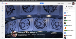
2,120 pixels x 1,192 pixels displaying in a 16 x 9 ratio. That’s the size of the new cover photo, double what it was before the change. Ostensibly to give you more room to display a picture, the new move is drawing criticism from certain quarters because it pushes everything else below the fold. Just take a look at mine (on the left) after implementing the new cover.
Once you scroll down, the cover image moves up and out of sight leaving a small bar with your name on it, returning the large amount of screen space it uses. I think it’s a bit much, but even so I’m betting it will grow on people with time.
Businesses need to be particularly aware of this change. If you had your cover photo specially designed for Google+ then it is time to design a new one.
“About” Tab Gets a Facelift
Anyone familiar with Google Now will recognize the card-style layout of the new “About” tab. Each section is independently editable and has granular controls allowing you to set its visibility using your circles. Some of the sections include:
- “Story” tab outlines basic information about who you are.
- “Places” shows where you have lived.
- “Links” shows links to your blogs or social profiles as well as any other links you might wish to display.
- “Apps” shows activity from any Google Apps you are currently signed into.
- “Work” now includes something LinkedIn has debuted months ago, a section for skills.
A cleaner display of information and easier editing are the high points of this tab’s changes.
Reviews Gets a Tab of Its Own
Google has driven hard at consolidating the online review universe and bringing it under
the Google+ umbrella. Now the company is boosting visibility to your reviews
by consolidating them under a single tab. This I am sure meant to help mainstream the still underused Google reviews by making them more prominently linked to the reviewer. The more local reviews are made the more meat exists for Google Local Search.
How Does It Look Now?
Always use the “View Profile As” toggle, just under your cover photo. Select “Public” and make sure that everything that’s visible is what you want the average Web surfer to see. If you see something that you want restricted, edit the permissions for that piece of information.
More From the Big G?
Casey Newton at CNet notes that these changes are not being rolled out in a vacuum:
And it’s not the only move Google made today on that front. The company also announced developer boot camps to promote its new ‘Google+ Sign-In’ feature. Responding to what it called ‘huge interest’ from developers, the company will host nine five-day boot camps in Mountain View, Calif.; London; New York; Berlin; Bangalore, India; Sao Paulo; Sydney; Seoul; and Tokyo. The boot camps will take place between March 11 and April 12.
To see if your page has gotten the updates, click here.